The Brand

An intersection of editorial & data
Business of Business brand overview

Typography & color

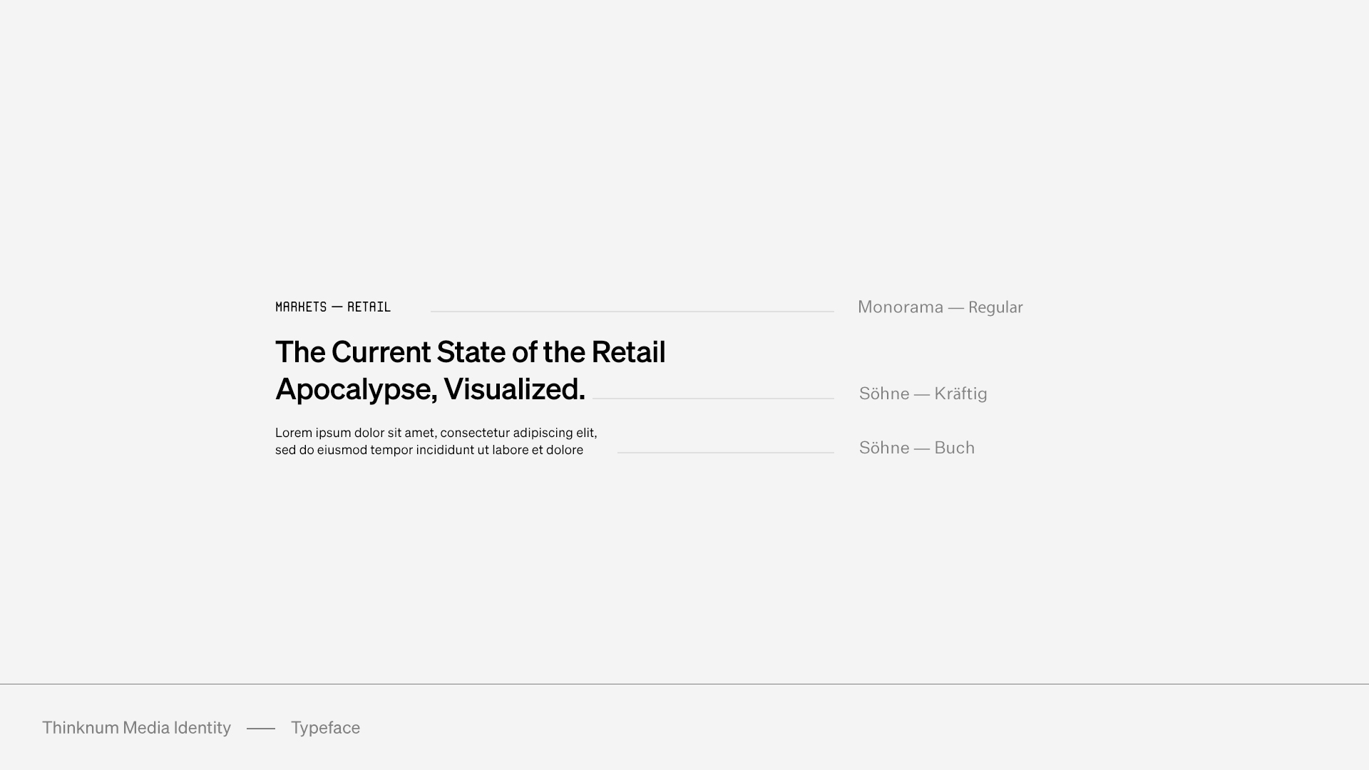
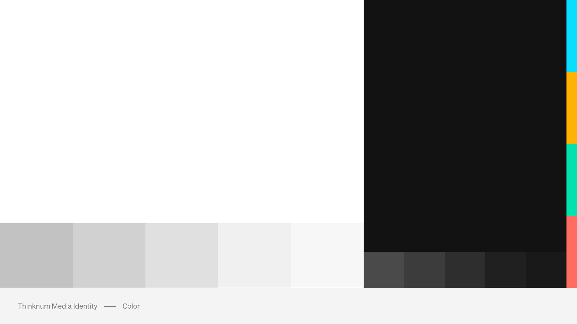
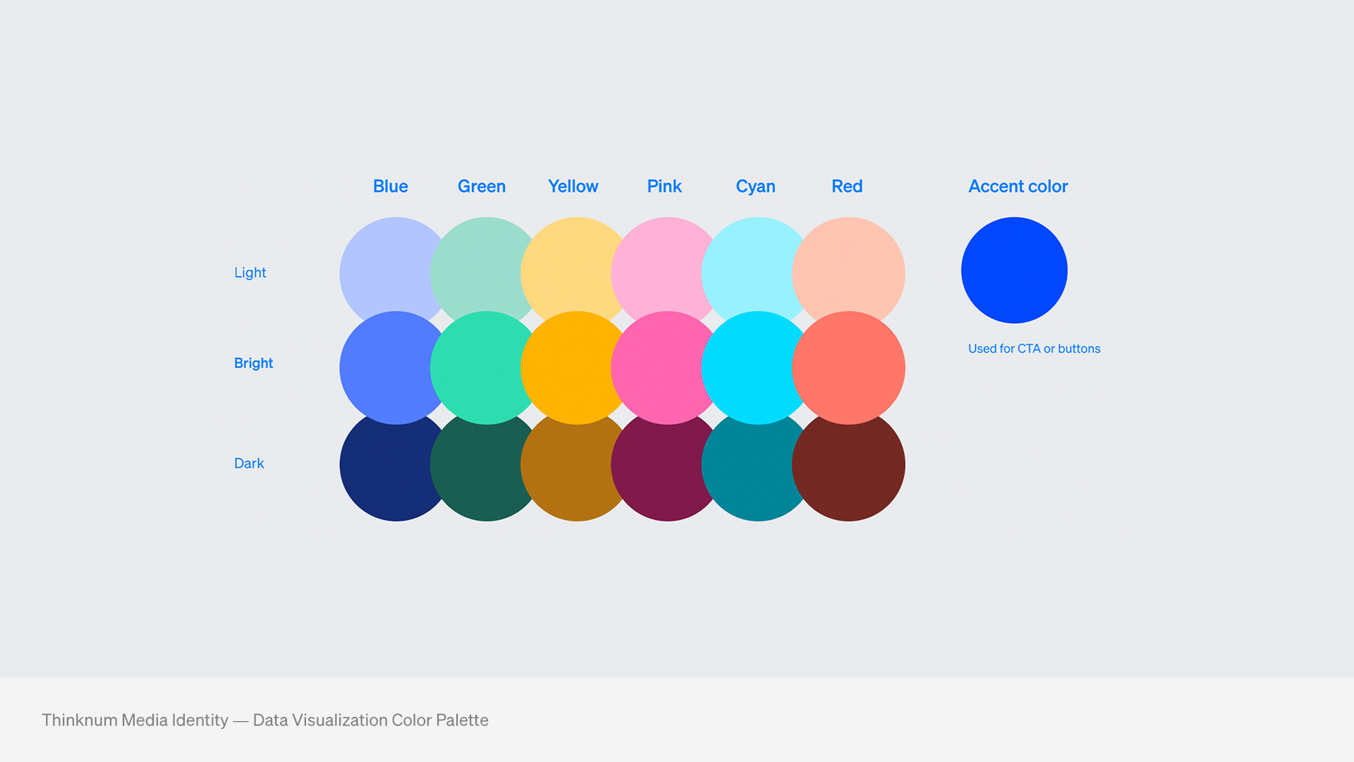
Typography was selected based on legibility at scale, working for both large headers and paragraphs. To appeal to younger audiences, it simultaneously has a serious but modern tone. The publication covers four main topics: technology, markets, innovation, and people; the color palette was selected to reflect them.

Typography
Color palette

The Data

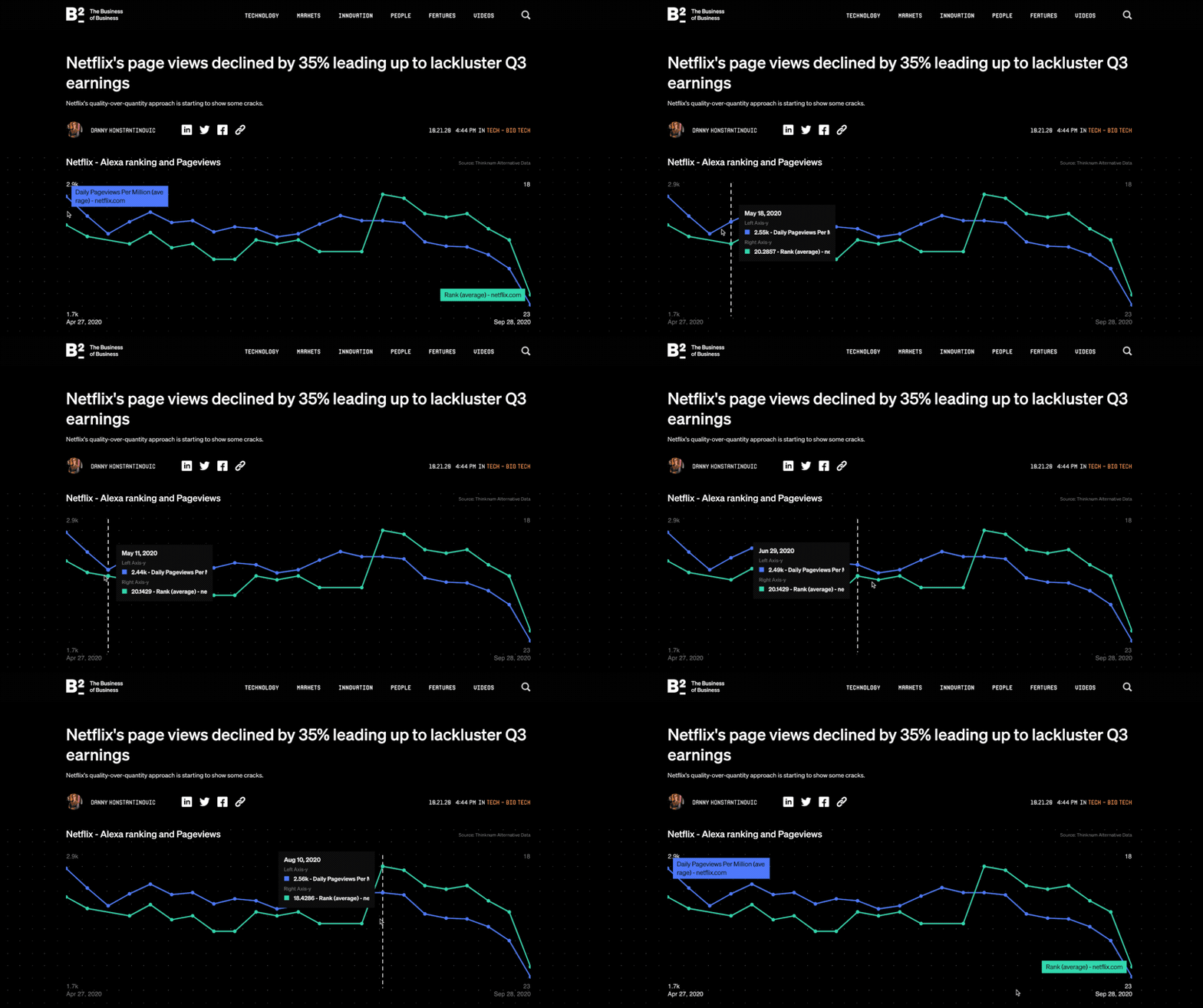
Interactive embeds and visualization palette

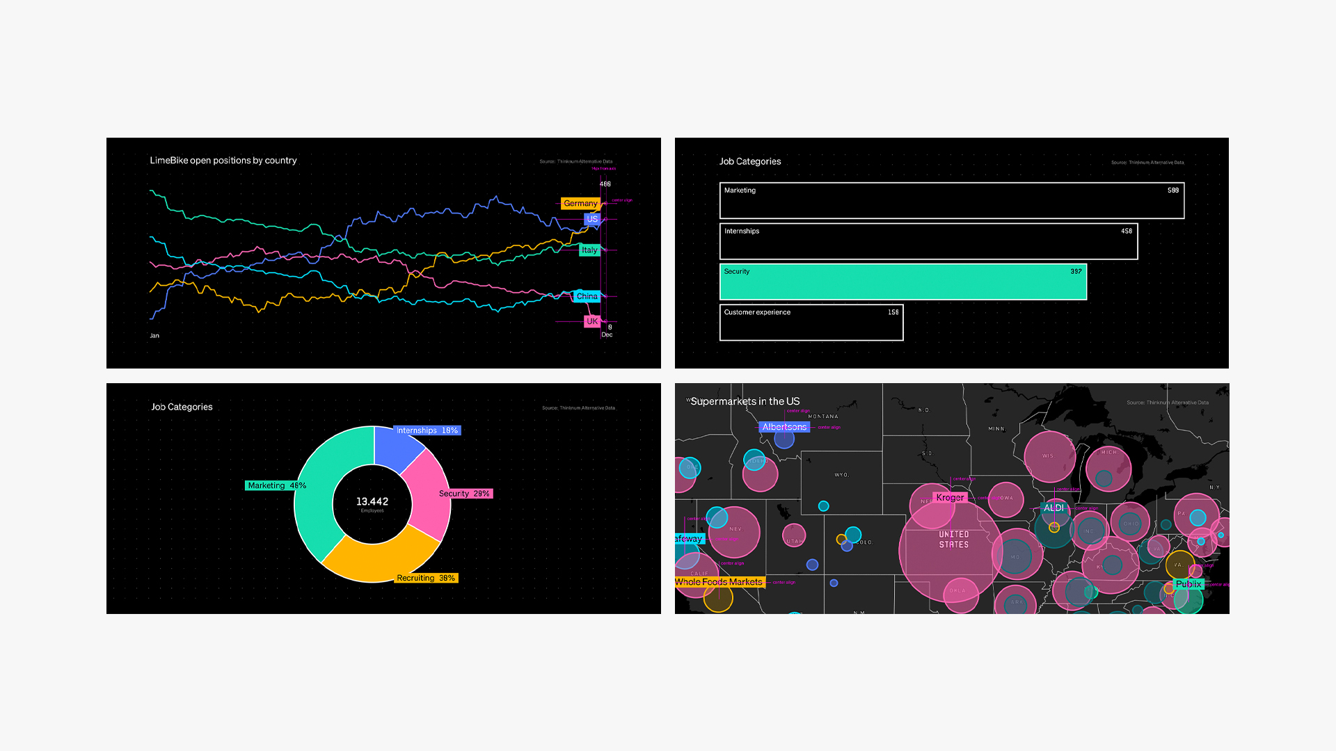
The Business of Business utilizes Thinknum’s data throughout the site to drive business insights. We wanted to implement interactive media embeds (opposed to screenshots) and redesign the interface to distinguish the data from the Thinknum platform. We reached out to Pentagram to collaborate on a series of four interactive chart embeds (line, bar, map, pie) that fit within the brand identity. A new sub-palette was introduced to functionally be applied within the visualizations themselves.
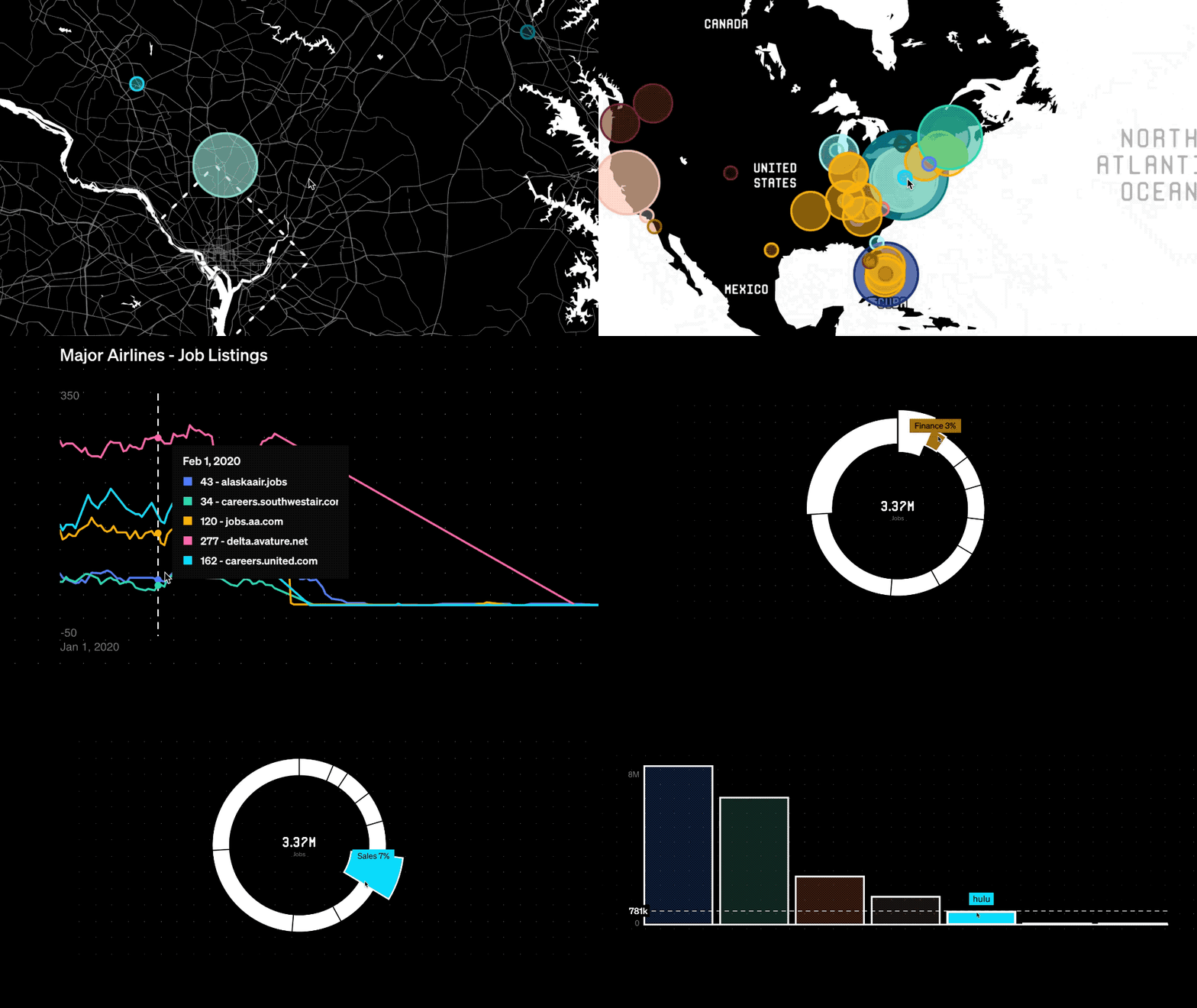
Data visualization animation
Data viz color palette
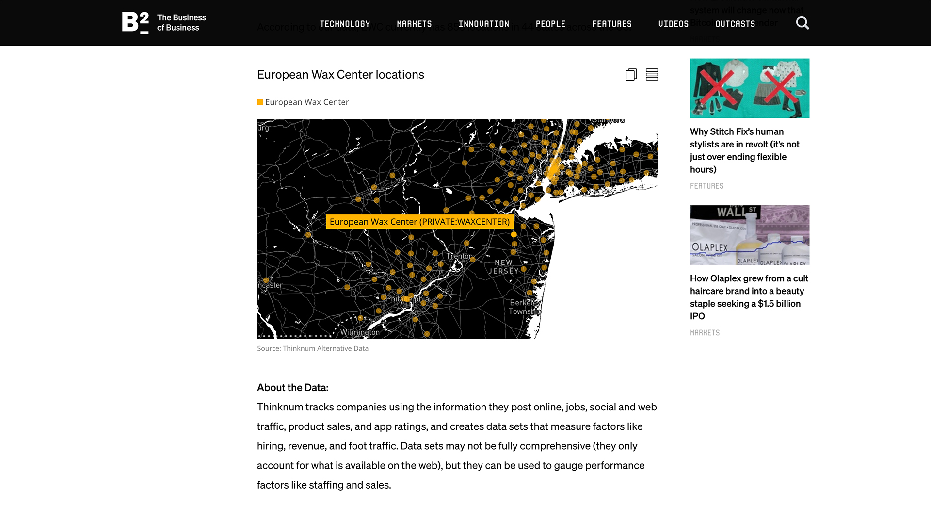
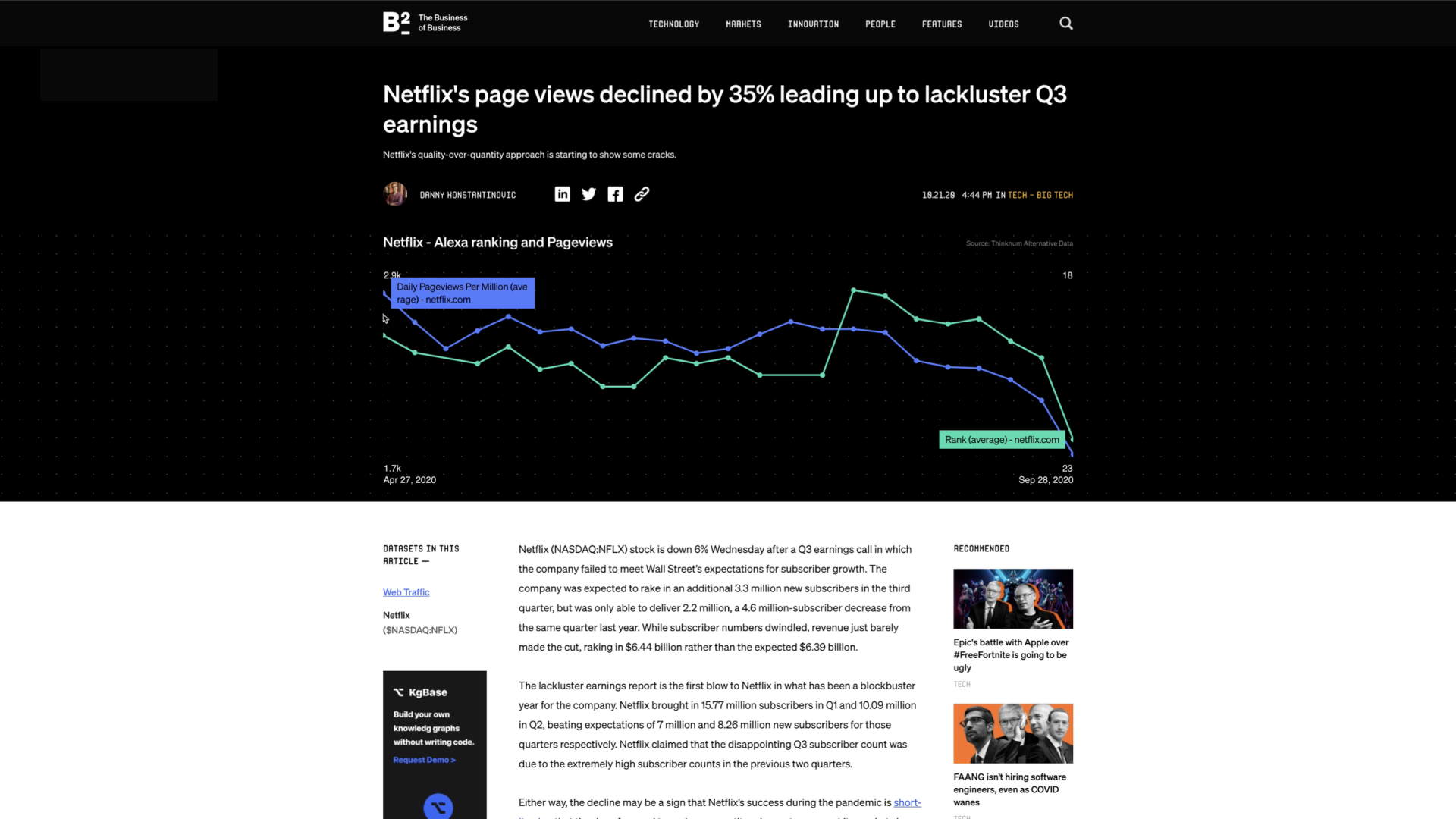
Article visualization example

Imagery

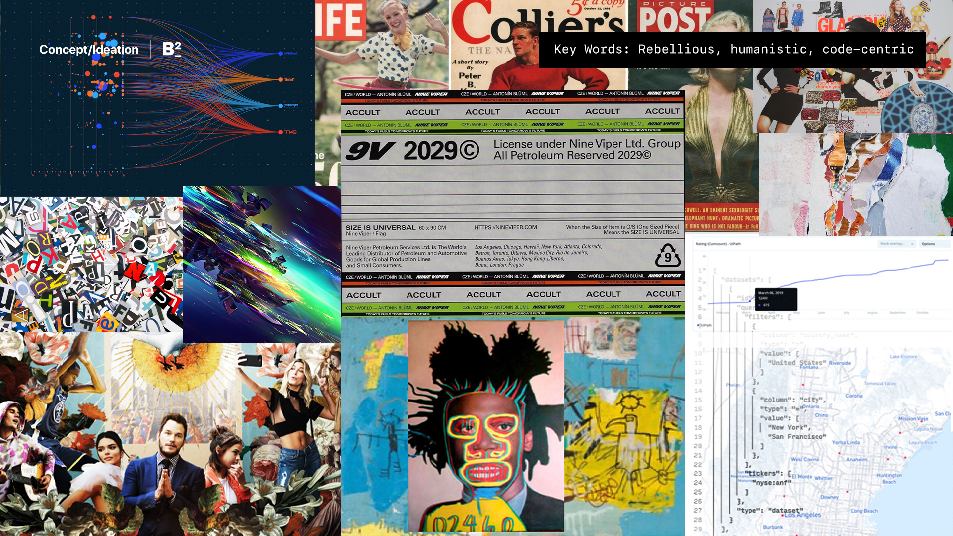
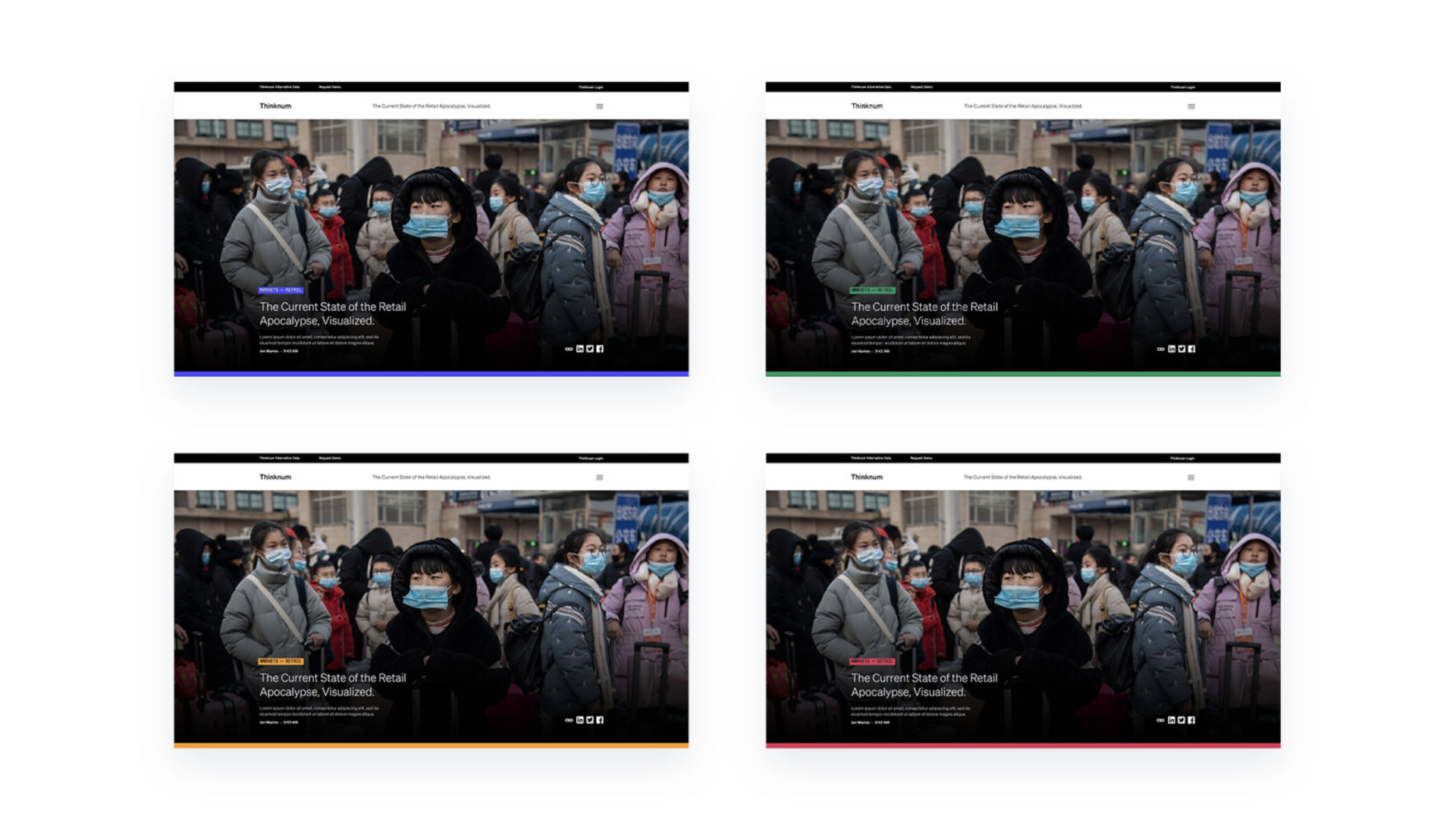
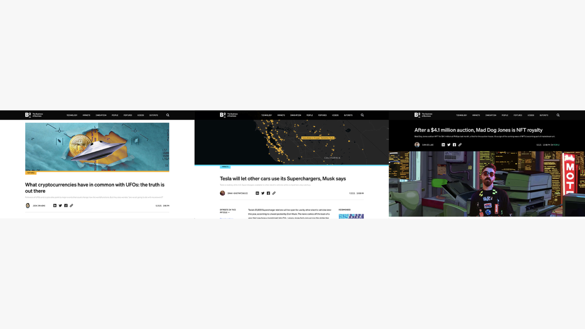
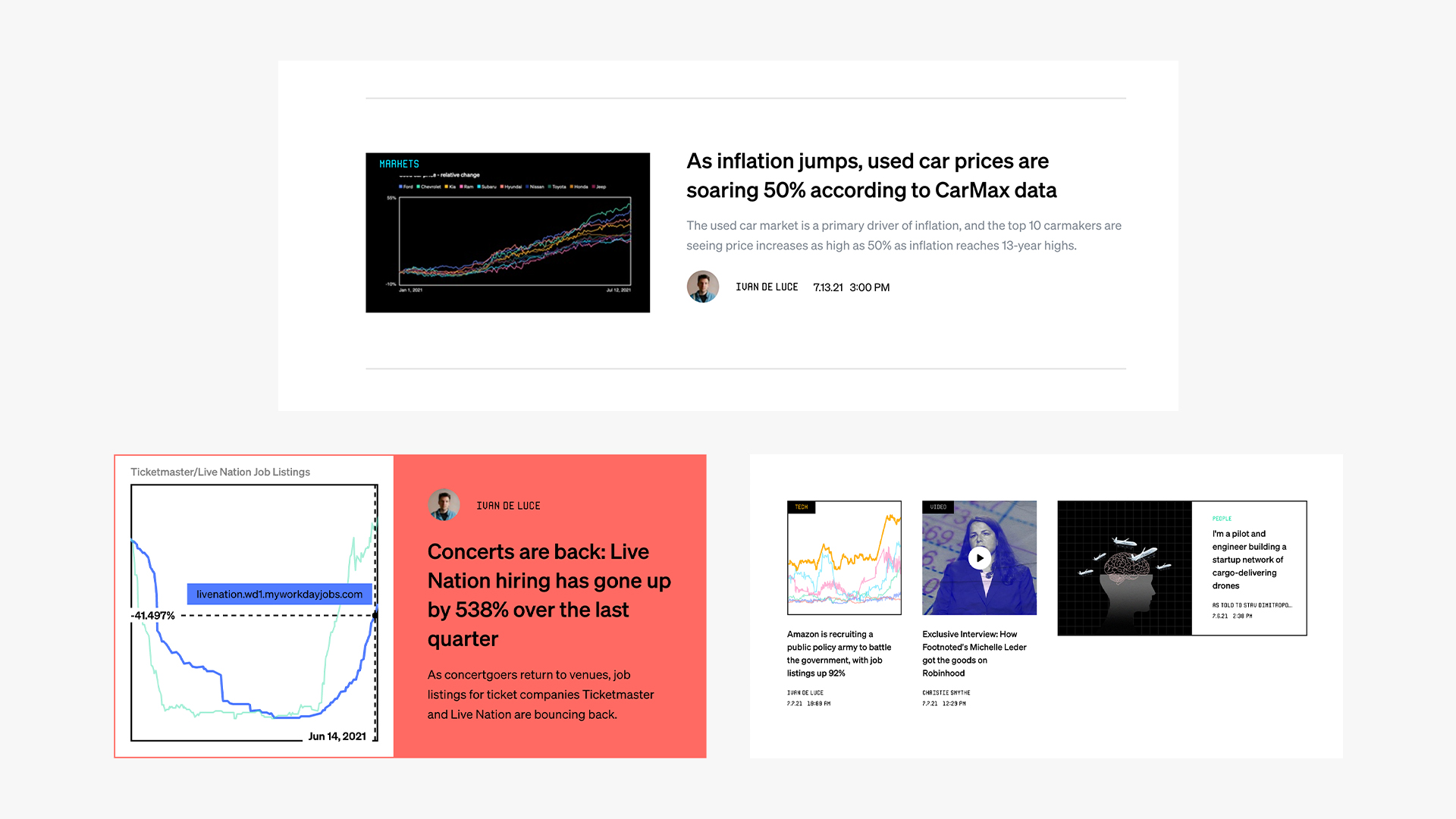
Every article came with a thumbnail, which also served as a header image. The visual direction is in line with the mission statement to provide raw, transparent stories and interviews — code-centric, human-centered, and rebellious.

Header image collage
Header article example

The Product

Reimagining the ecosystem
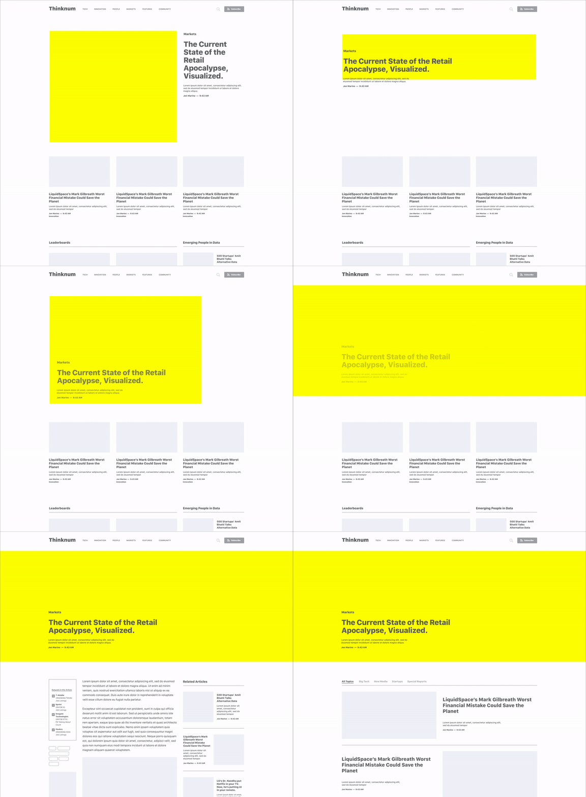
Product overview

Research & insights

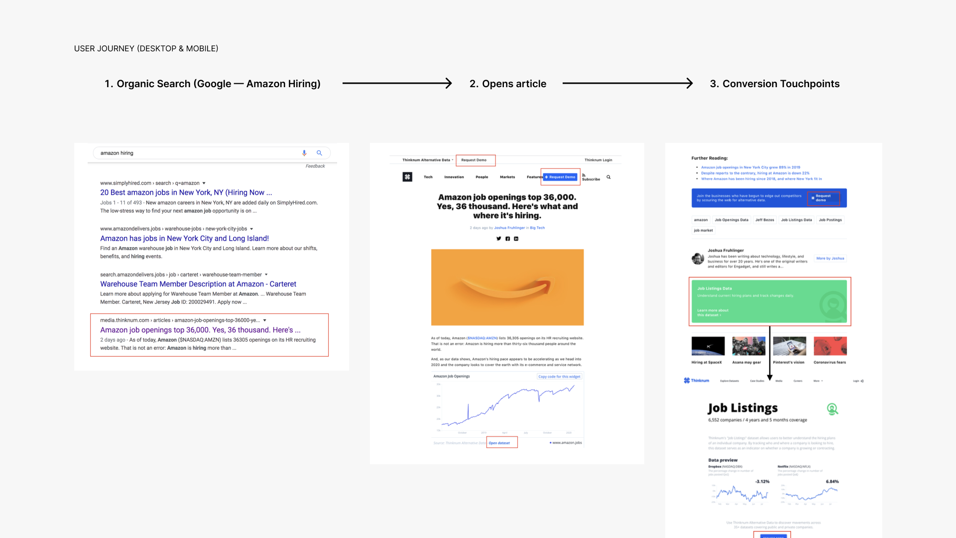
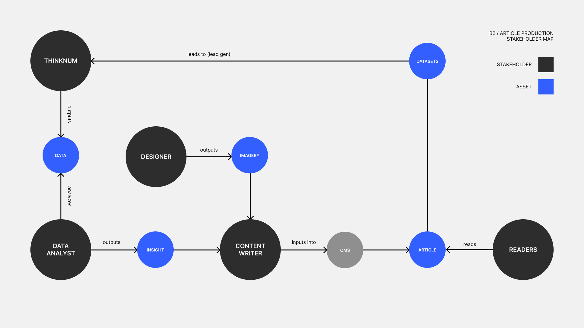
I conducted a deep analysis of the current state of the website to figure out key painpoints and insights for all stakeholders involved. The website’s purpose was to drive lead generation to the Thinknum platform.

Research insights

83% of new visitors interacted first with a single article page
54% of visitors accessed content on mobile
78% of users came from organic search
10% of users came from referrals
88% bounce rate

Article pages needed to make the most impact in order to acquire users for both the media site and the Thinknum product. Data needed to be a key conversion touchpoint.

Stakeholder map

The article page

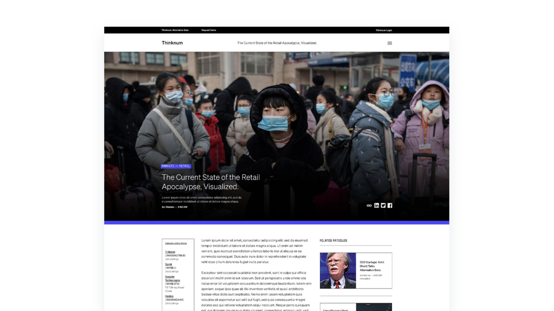
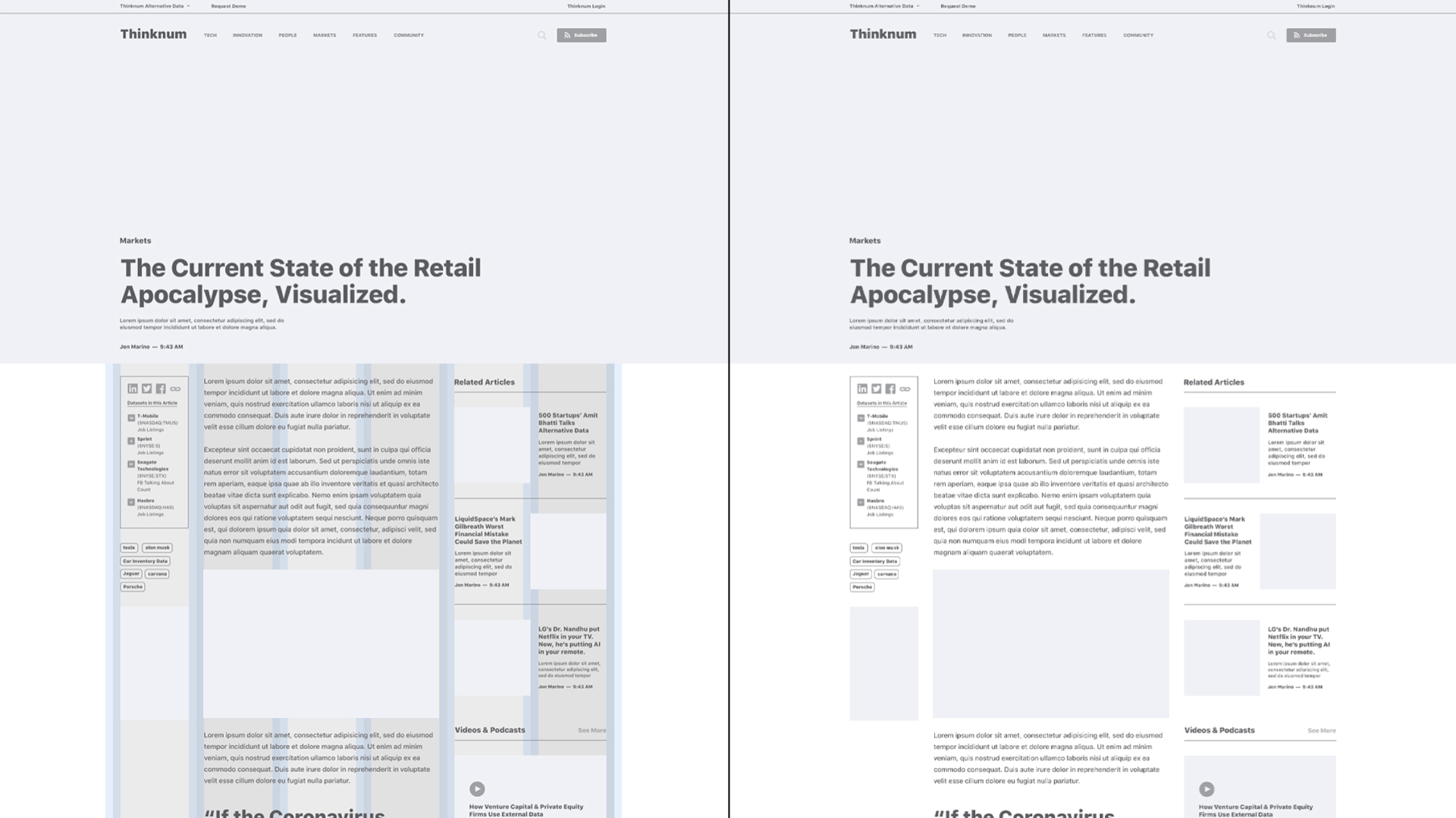
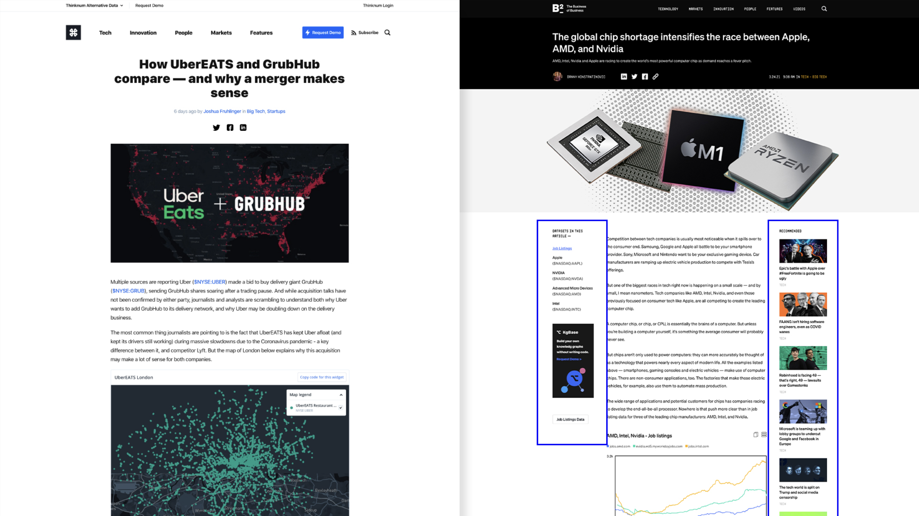
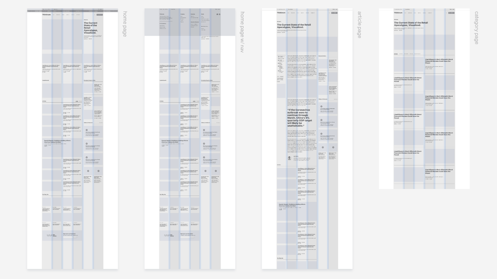
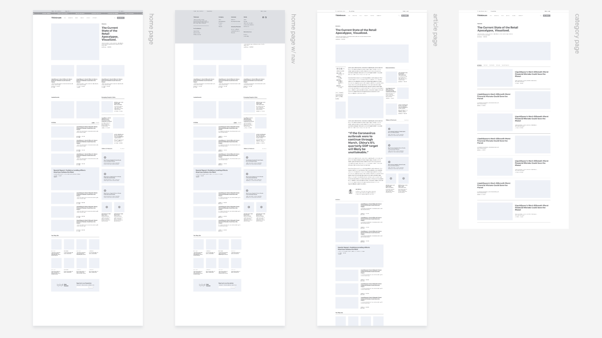
The article page would become the driving factor for key design decisions throughout the entire website. The new design accounts for painpoints by having extra columns that serve their respective functions.

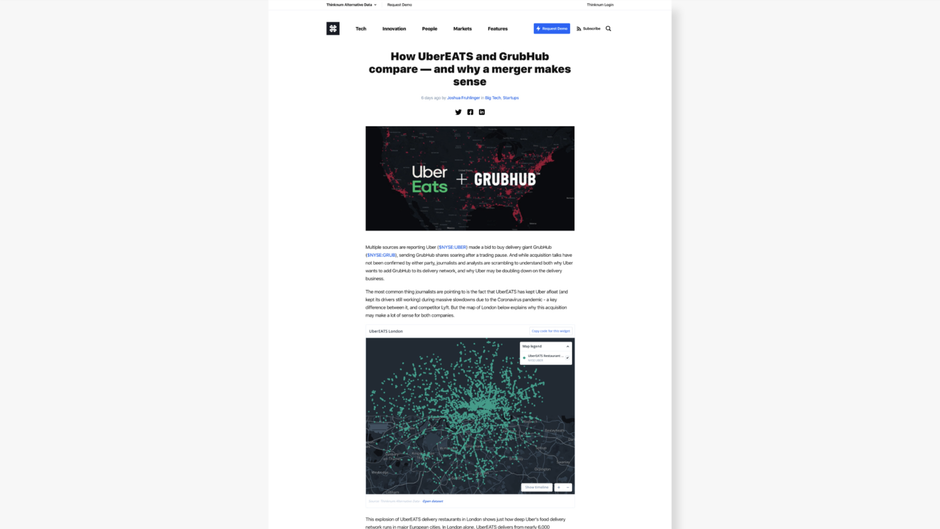
Old article page
New article wireframe
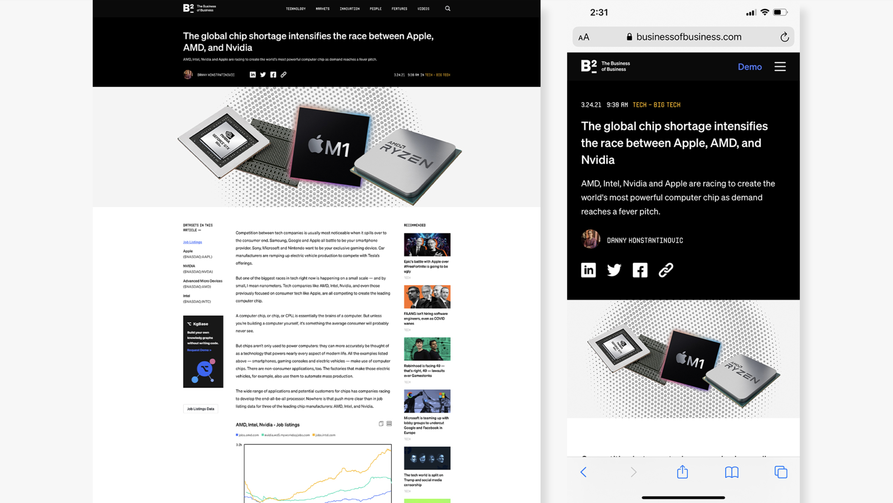
Article page comparison
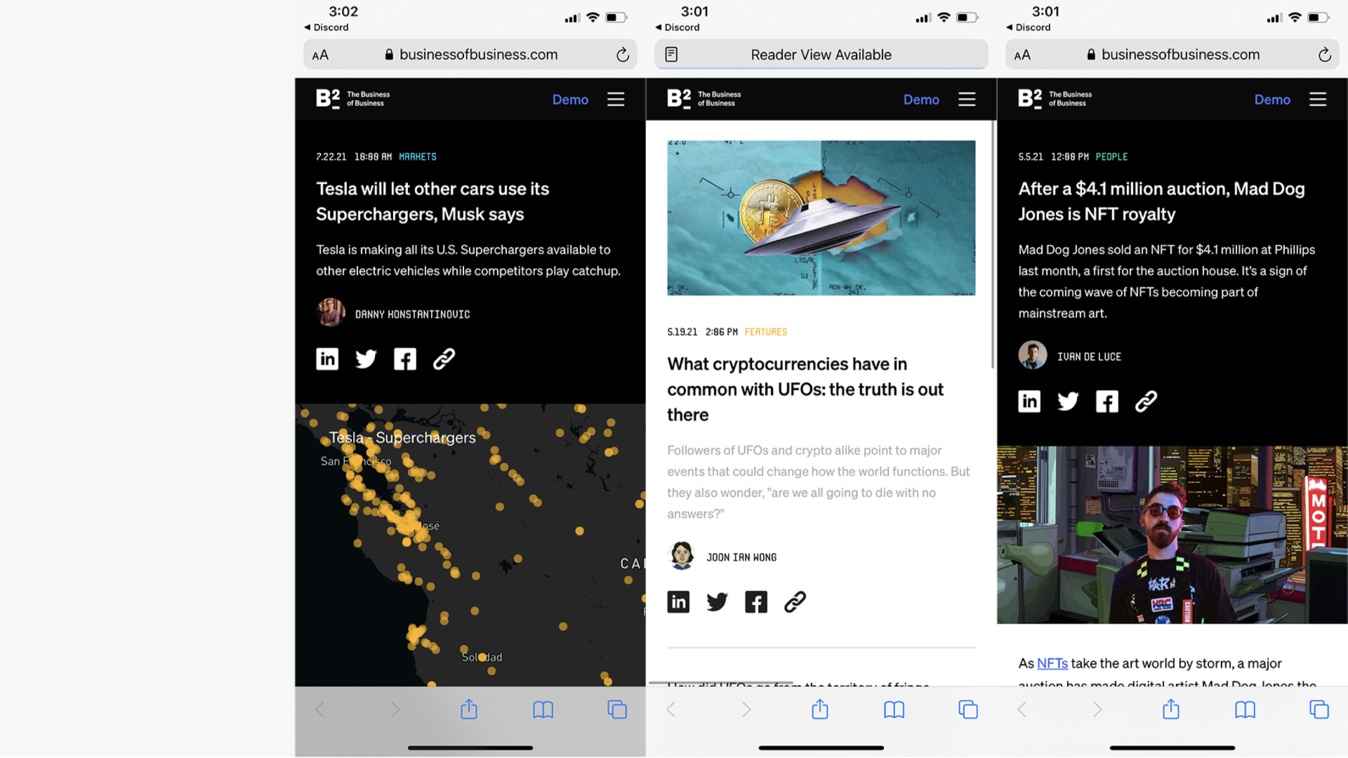
Different headers desktop
Different headers mobile

Creating a system

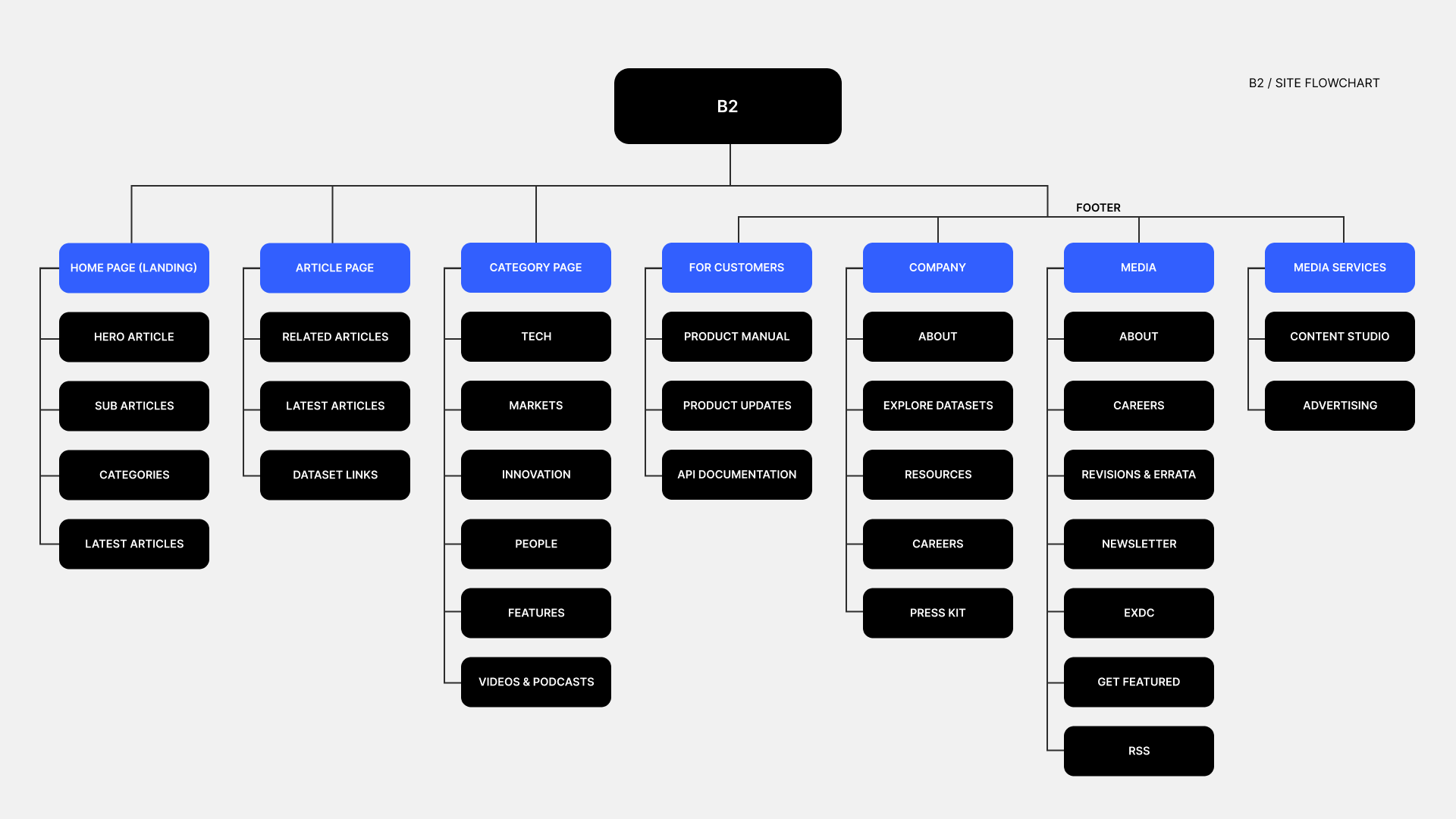
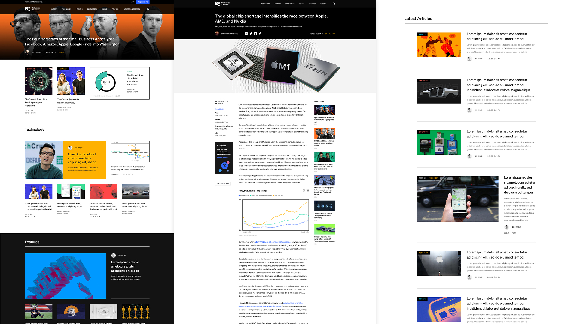
Elements were taken from the article page to expand the site into the necessary pages it required, creating a visual system that would create consistency throughout.

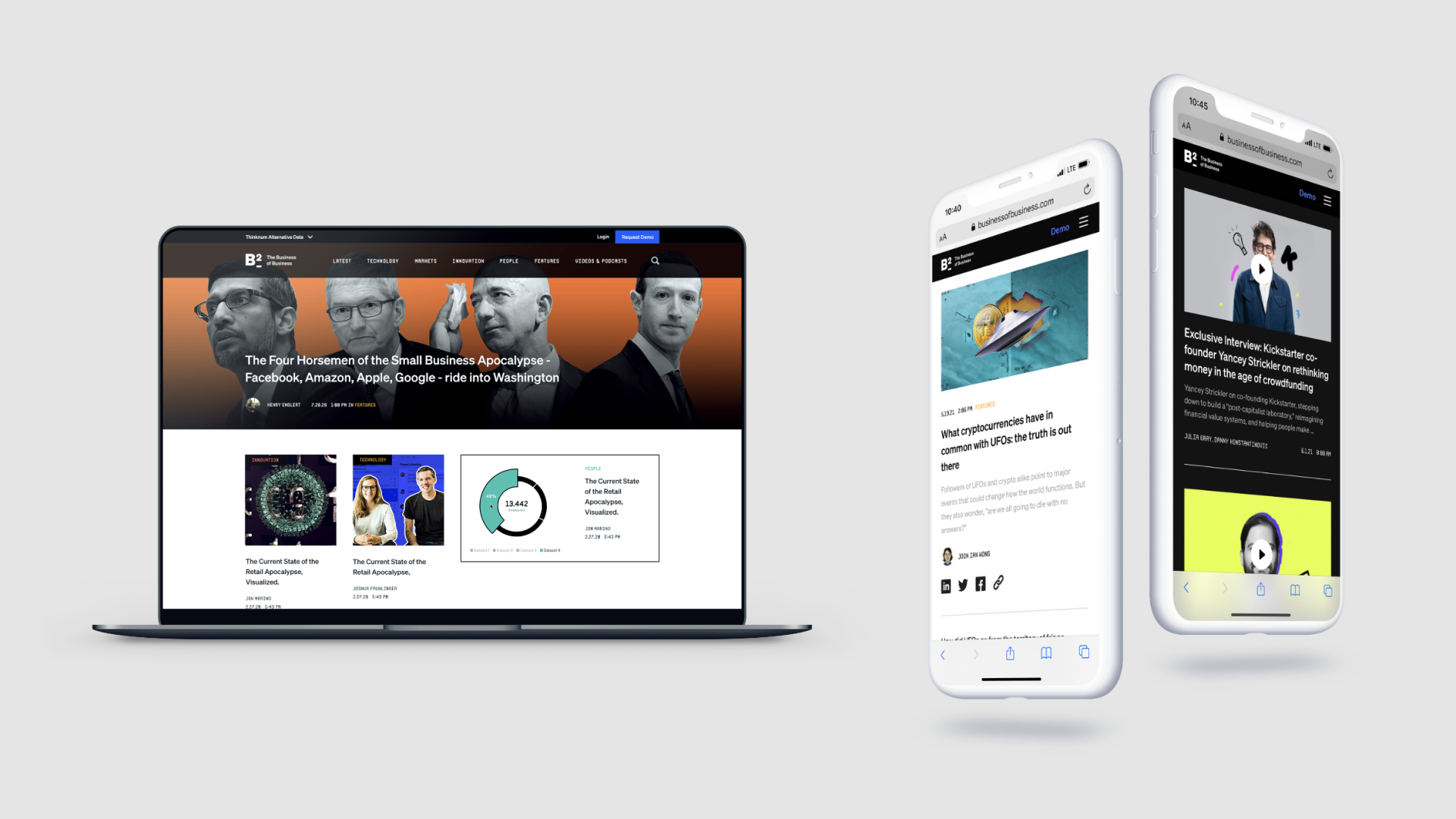
Modular hero system
Site flowchart
Different pages

Integrating the data

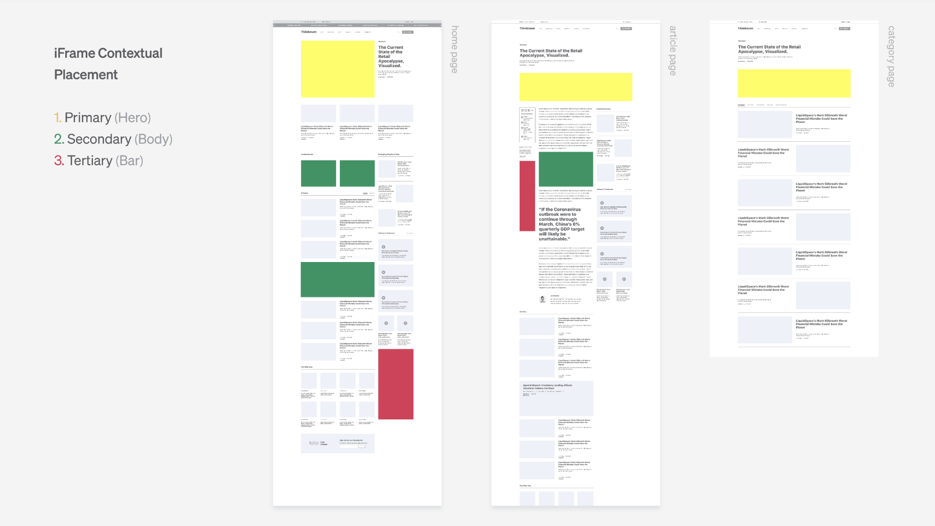
Working with Pentagram, we created four different types of visualizations that would serve as interactive frames embedded throughout the site.

Further touchpoints

Expanding the ecosystem
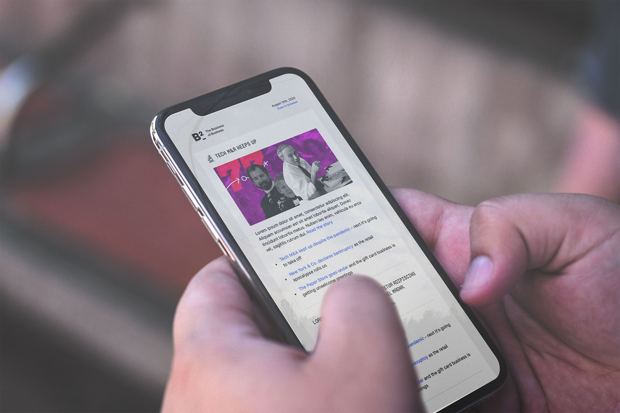
Newsletter

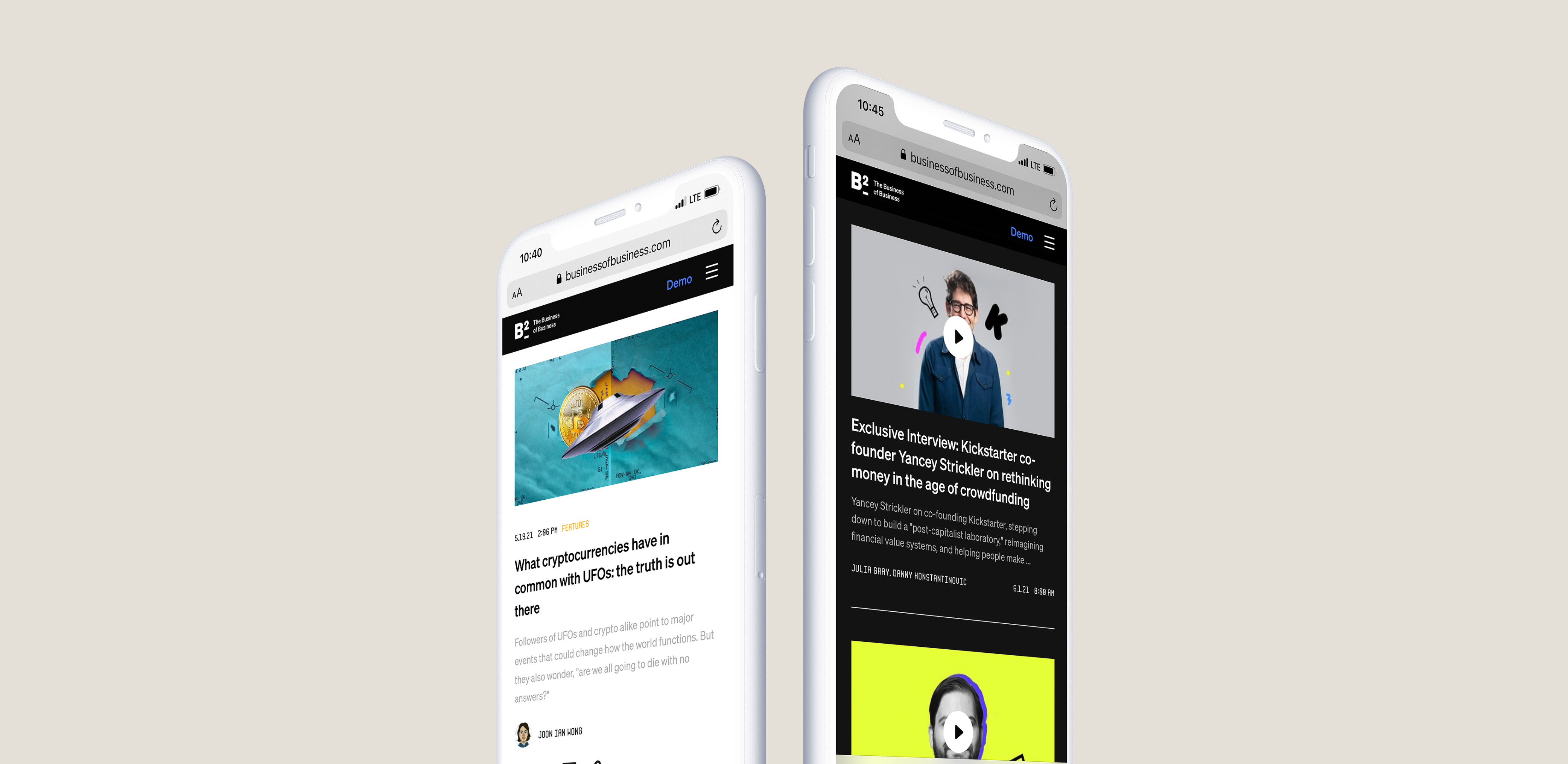
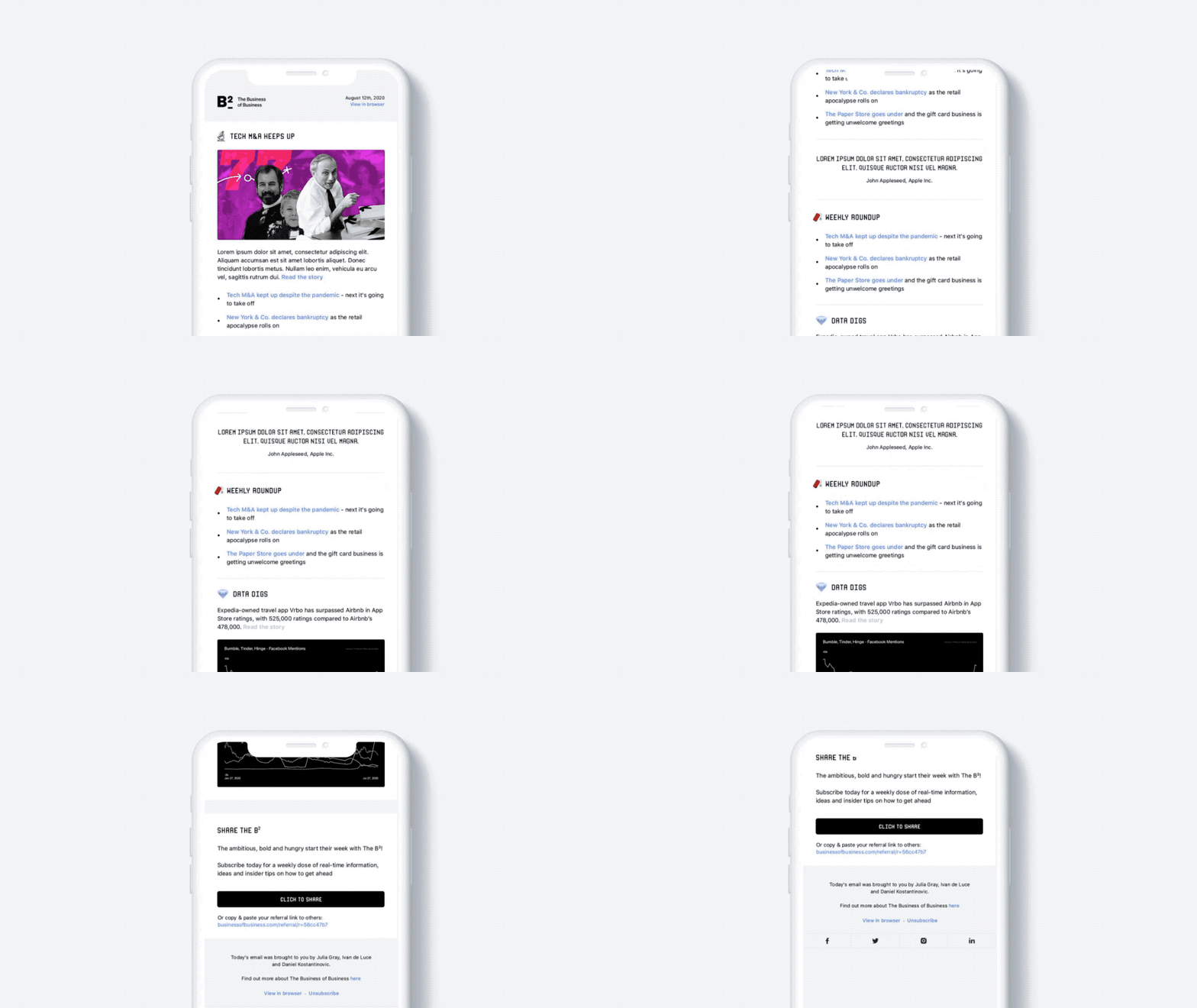
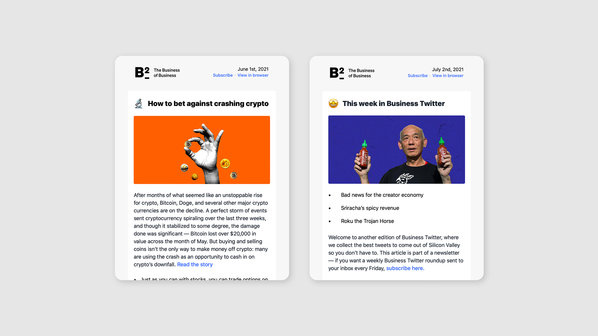
Aside from the website, The Business of Business sent out weekly newsletters highlighting our articles as well as handpicked business tweets that were relevant to our content.

Publication in hand
Newsletter scroll

Media

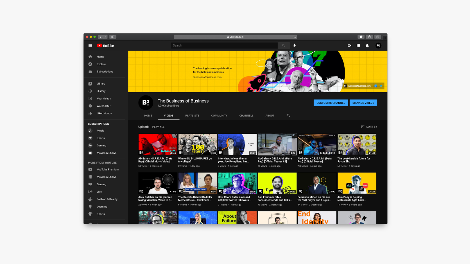
We also conducted raw, unfiltered interviews that would be posted on our Youtube channel; these would also become transcripted articles available on the website.

Media and interviews

Social marketing

A series of videos were created to be used as social marketing assets.